Mecca.com Releases More Features And New Design
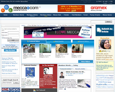
![]() Mecca.com, the Muslim community portal, that also integrates a social networking and user generated content platform, has just rolled out a new look, unveiling a new logo and a re-design for their whole website.
Mecca.com, the Muslim community portal, that also integrates a social networking and user generated content platform, has just rolled out a new look, unveiling a new logo and a re-design for their whole website.
The new design is more colorful and looks more hip; it also feels better organized, optimizing the use of screen real estate.
This new design, comes just a short while after Mecca.com rolling out their new Videos section, where members can upload and share their videos with friends. As with other online video sharing services, friends have the ability to comment, rate, edit, and share videos with other users.
Mecca.com had also enhanced their Photo sharing feature by improving the user interface, and adding the possibility to import photos from Facebook and Flickr.


Old design seemed better but change is good
Old design seemed better but change is good
The new look with colorful bubbles looks like a complete rip-off of Muxlim.com’s design!!!
The new look with colorful bubbles looks like a complete rip-off of Muxlim.com’s design!!!
Mumeo.com also releases new design and more features, its the best and the safest.
Mumeo.com also releases new design and more features, its the best and the safest.
It’s really cool to read a review about Mecca on Startup Arabia! Good to know you’re keeping an eye on it 🙂
It’s really cool to read a review about Mecca on Startup Arabia! Good to know you’re keeping an eye on it 🙂
@MaX: Thanks for letting me know; I just checked Mumeo’s new design.
@Shaden: It’s a pleasure. Please do not hesitate to share with me any news and developments happening on your side.
@MaX: Thanks for letting me know; I just checked Mumeo’s new design.
@Shaden: It’s a pleasure. Please do not hesitate to share with me any news and developments happening on your side.
The re-design of the website looks amazing. I think it will win some new fans and attract more visitors.
source:
http://www.pricelooker.co.uk